

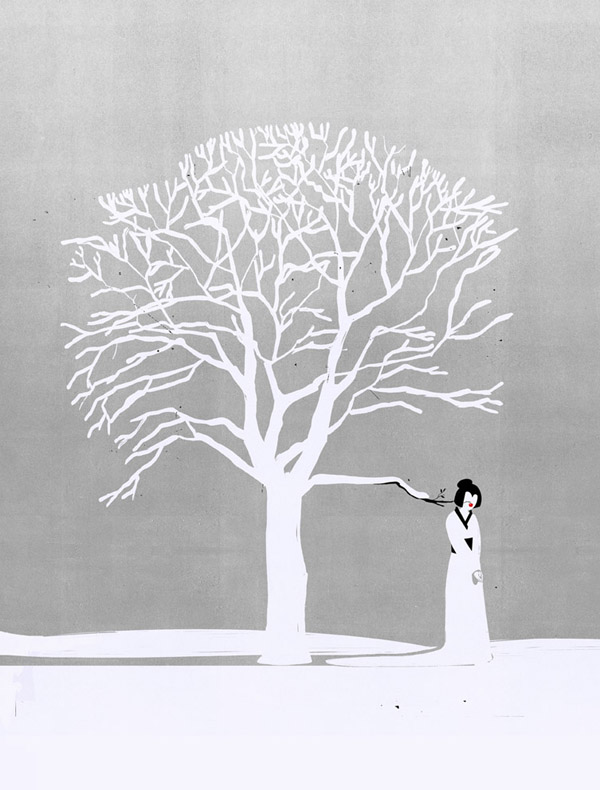
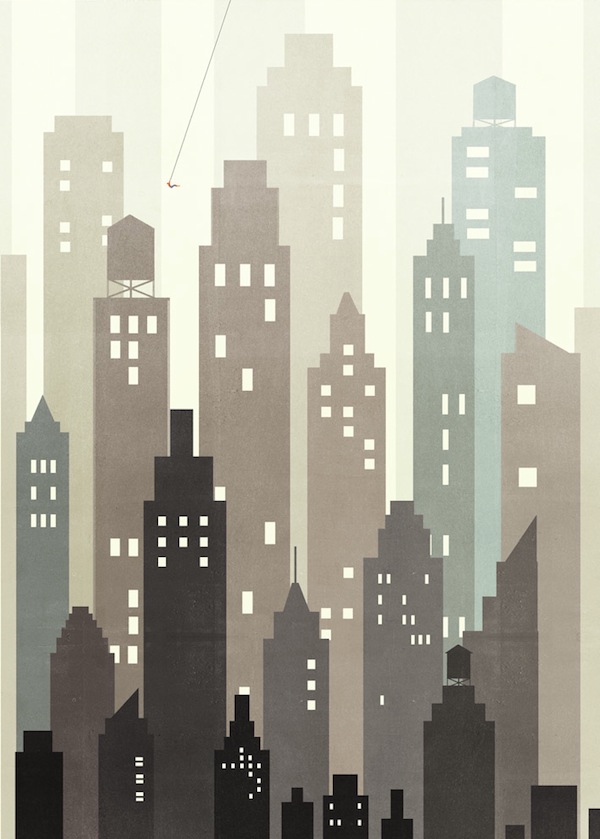
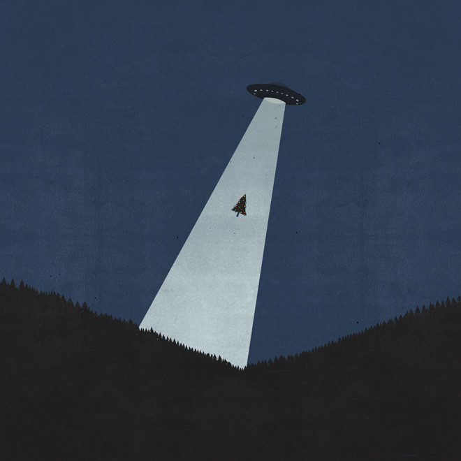
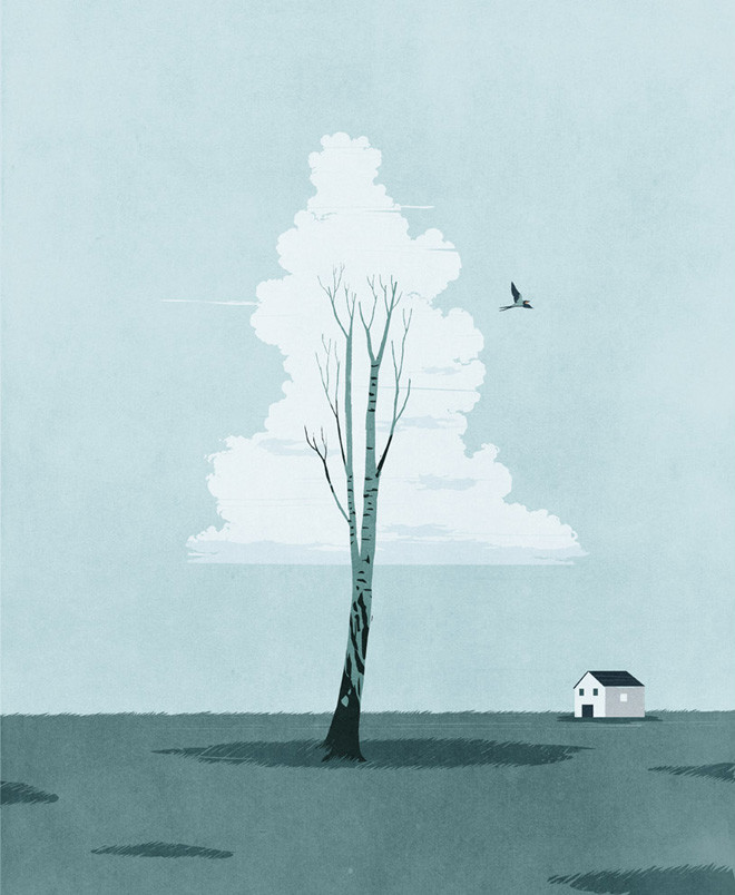
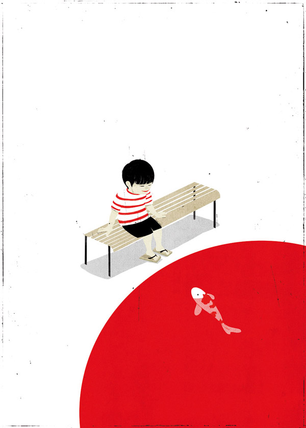
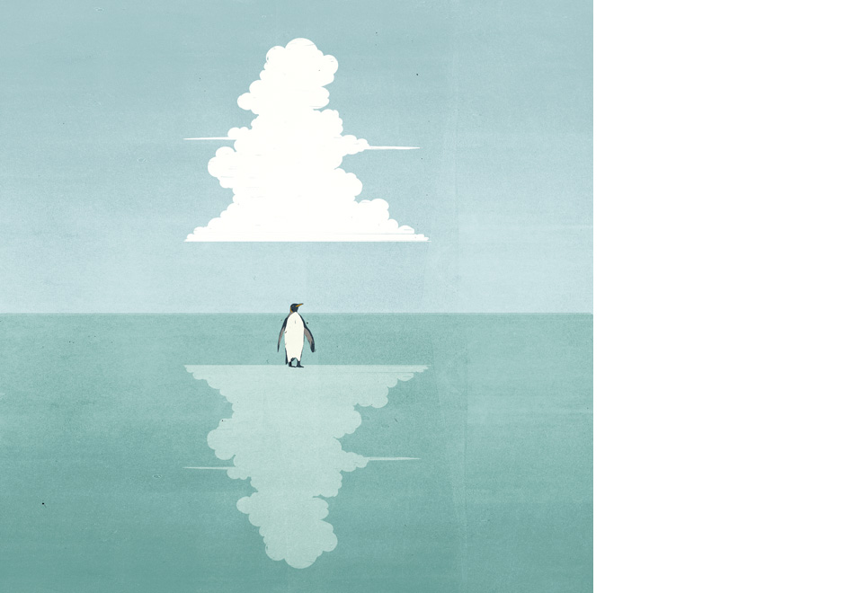
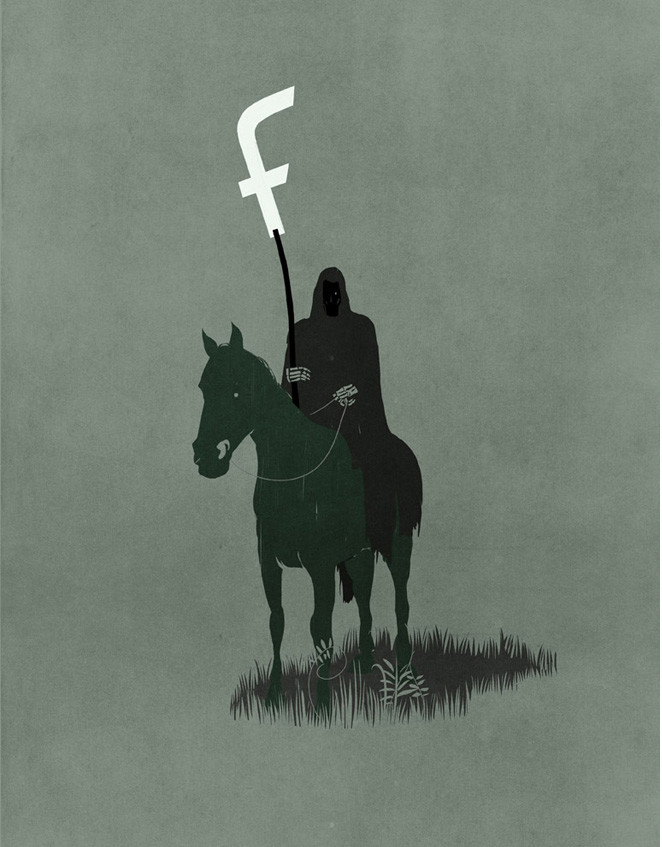
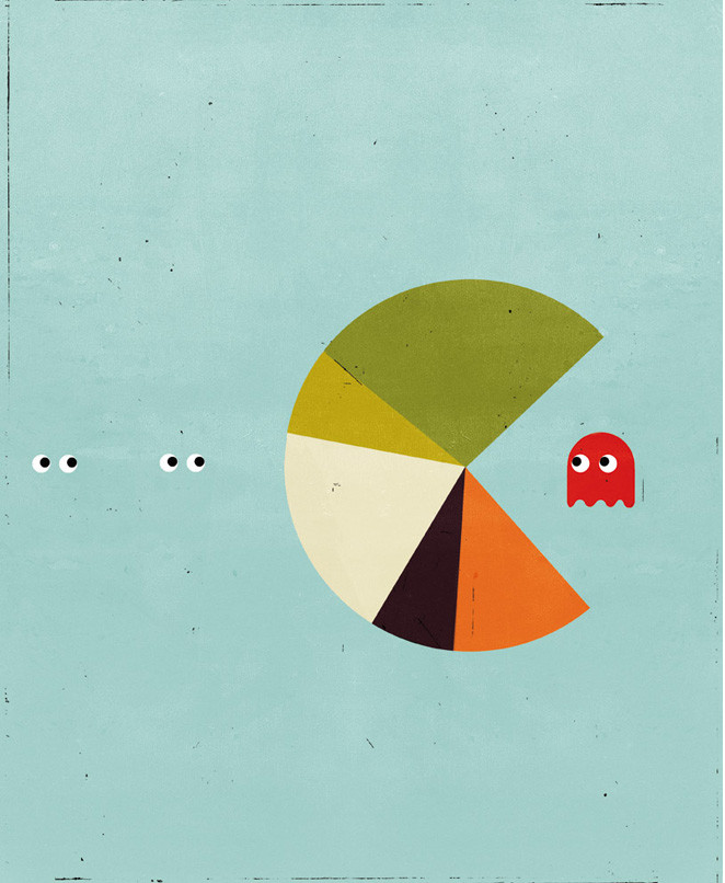
Iniziamo il nostro viaggio attraverso il mondo dell’illustrazione Made in Italy con una vera e propria eccellenza italiana: Alessandro Gottardo, aka Shout. Laureatosi allo IED di Milano, Shout si è distinto nel corso degli anni con il suo stile minimal e concettuale, conquistando letteralmente il cuore di riviste italiane ed internazionali. Collabora, infatti, con giornali come il TIME, Wired, il New York Times, il New Yorker, il Wall Street Journal, Le Monde, l’Economist, l’Internazionale, Repubblica e molti altri. Ha inoltre ricevuto illustri riconoscimenti internazionali, tra cui diverse medaglie d’oro e d’argento da parte della Society of Illustrators di New York. Oggi si racconta a The WalkMan.
Per prima cosa ti chiedo uno sforzo di memoria: ricordi il momento in cui realizzasti che saresti diventato un illustratore?
Ero ancora allo IED di Milano, al terzo e ultimo anno attorno al mese di maggio. Fino a quel momento la mia esperienza allo IED mi aveva scoraggiato a intraprendere questa carriera, poi incontrai per la prima volta il lavoro di un mio docente, Paolo D’Altan, che disegnava al computer utilizzando una penna grafica su una tavoletta. Era l’anno accademico 1999/2000, Internet stava entrando nelle case dei privati era chiaro che quello sarebbe stato il futuro. Capii subito che il disegno a computer mi avrebbe permesso di essere molto più veloce e affidabile, mentre Internet mi avrebbe permesso di cercare lavoro laddove c’era l’offerta senza muovermi di un centimetro dall’Italia: in quel preciso momento, facendo questa addizione “illustrazione in digitale + internet” realizzai con chiarezza che avrei potuto fare questo mestiere.
Nel tuo percorso formativo ci sono stati dei Maestri a cui ti sei ispirato? Quanto è importante avere dei punti di riferimento e poi riuscire a distanziarsene?
L’imprinting l’ho avuto da Mattotti, quando durante un corso di storia dell’illustrazione vidi per la prima volta i suoi lavori. La possibilità di raccontare una storia anche complessa con l’utilizzo di una sola immagine mi ha fatto subito innamorare di questo mestiere. Dopo di lui molti altri mi hanno fatto capire quanto bello fosse questo lavoro, italiani e stranieri.
All’inizio di questa carriera avere dei riferimenti è stato importante, ho sempre detto che i maestri sono tali poiché ti indicano la via da percorrere, l’importante è non averne uno solo ma molti contemporaneamente in modo che il tuo linguaggio non venga intrappolato da stilemi di cui sei innamorato. E’ importante avere come riferimento il lavoro di maestri con stili molto diversi tra loro. Inoltre è molto importante, direi essenziale, avere stimoli che vengano da ambiti artistici diversi come quello del teatro, della fotografa, della musica, del cinema e della letteratura. Nel mio caso, ad esempio, i racconti di Carver hanno influenzato molto il mio linguaggio. Quando leggi sei tu il regista, quello che immagini poi lo disegni.
Inventare un linguaggio proprio è indispensabile, è come fabbricarsi delle scarpe con cui camminare, se non calzano perfettamente sui tuoi piedi dopo 100 metri avrai le vesciche e non potrai più andare avanti.
Più ci soffermiamo sui tuoi disegni e più essi ci svelano indizi che prima non avevamo notato, mostrando una cura dei dettagli che denota notevole lavoro di ricerca ed approfondimento tematico. Trascurando quindi, per il momento, l’aspetto puramente grafico, quali sono secondo te le qualità che un buon illustratore dovrebbe avere?
Ci sono scuole di pensiero che vorrebbero i migliori illustratori venire da formazioni non artistiche ma autodidatte o simili, io la penso diversamente. La mia formazione artistica, specie quella che ho avuto al liceo artistico di Venezia, è stata assolutamente fondamentale e mi ha dato strumenti in grado non solo di adattare con disinvoltura il mio stile alla commessa a cui sto lavorando ma anche di poter immaginare un’evoluzione del mio linguaggio. A distanza di tempo mi rendo noto che tutto ciò che ho imparato da studente mi torna utile sempre di più. I miei studi dell’anatomia, della prospettiva, delle tecniche ad acquerello, olio, tempera, acrilico, matite colorate, chine eccetera sono un bacino da cui vado ad attingere costantemente mentre realizzo un immagine anche se questa poi è realizzata digitale.
Per cui il consiglio che mi sentirei di dare a un aspirante illustratore è di studiare disegno, moltissimi giovani aspiranti illustratori hanno grosse lacune in questo senso e, per chi come me ha studiato, gli errori che commettono sembrano macroscopici ma loro che evidentemente non vengono da studi formativi non li vedono, il che è un grosso problema.
La capacità autocritica di poter giudicare con obiettività il proprio lavoro, senza trasporto emotivo, è alla base del continuo miglioramento, se non ti accorgi che il disegno che hai fatto è brutto non potrai mai farne uno bello.

Focalizziamoci ora sull’immagine. Cosa deve possedere un’illustrazione perché possa essere efficace nella trasmissione di un concetto, di un‘idea?
Come definiresti il tuo stile?
Il mio stile è concettuale, per cui prima l’idea poi lo stile, anche se uno stile c’è, è chiaro, ma si è formato attorno a questo principio. Come se l’idea fosse l’ossatura e lo stile fossero i muscoli che consentono di far muovere il corpo. Dal mio punto di vista ogni singolo dettaglio, compresa la tavola colore, può distrarre un occhio dalla comprensione del concetto, per cui partendo dal presupposto che il concetto è prioritario allora il colore e la composizione dovranno andare a supporto dell’idea a non nasconderla. Ho detto anche in passato che lo stile è il rossetto sulle labbra di una bella ragazza, la bellezza deve essere risaltata non coperta.
Le tue illustrazioni, oltre che in Italia, fanno il giro del mondo e, soprattutto, il giro degli Stati Uniti. Esistono delle differenze nei rapporti tra artista ed editore o tra i lavori richiesti sul suolo italiano e quello estero?
Beh, ci vorrebbe un trattato per spiegarne le differenze. Anche in questo caso ho spesso usato questo paragone: l’illustrazione è come il baseball, in Italia non interessa a nessuno negli Stati Uniti è lo sport nazionale. Dal rapporto con il committente, dal modo in cui vieni trattato professionalmente, dal budget che viene proposto per realizzare un’illustrazione, la pura meritocrazia e la serietà estrema del tuo referente, il totale rispetto e conoscenza del linguaggio illustrativo, fino alla grande soddisfazione a portare a termine un lavoro. E’ difficile da spiegare, in 15 anni io ancora non lo so spiegare quanto i due Paesi trattino diversamente chi fa questo mestiere: lì sei una star, qui non sei nessuno. Per star intendo dal punto di vista prettamenteprofessionale, è ovvio che nessuno mi fermerebbe per strada a chiedermi un autografo.
The WalkMan ha come obiettivo quello di scovare e mettere in luce giovani talenti ed artisti che credono nelle proprie idee. Cosa consigli a chi, come te, ha deciso di investire la propria vita nella creatività?
Lasciate perdere la fama, l’obiettivo non è essere riconosciuti poiché si è famosi ma poiché si è bravi a fare il proprio mestiere. Il riconoscimento viene di conseguenza anche senza una pagina Facebook. Ci sono molte, troppe cose che distraggono i giovani dall’obiettivo, i social a mio avviso sono una di queste. Per me ha funzionato chiudermi in casa a lavorare notte e giorno, pasticciando, facendo disegni più brutti che belli, tenendo bene in mente cosa avrei voluto ottenere da lì a 10 anni, e non dall’oggi al domani.
Per cui seminate bene, siate pazienti e lungimiranti, un mattone alla volta senza guardare la cima che sembrerà lontanissima. Niente scorciatoie, poiché prima o poi se ne paga il pegno e difficilmente si riuscirà a mettere una pezza. Non scoraggiatevi, oggi più che mai il mercato è il mondo intero, non solo il Paese dove vivete. Non siate arroganti, la presunzione è una distrofia che impedirà al vostro talento di svilupparsi paralizzandovi. I grandi professionisti sono tutte persone consapevoli, spesso umili, che non hanno bisogno di dimostrare nulla, un motivo ci sarà.


[divider]ENGLISH VERSION[/divider]
Our travel through the world of Made in Italy illustration starts with a real Italian excellence: Alessandro Gottardo, aka Shout. Graduated from the IED in Milan, Shout stands out with his minimalist and conceptual style. He literally conquered the hearts of many Italian and international journals. Actually, he works with the TIME, Wired, The New York Times, the New Yorker, the Wall Street Journal, Le Monde, The Economist, Internazionale, Repubblica and many others. He also received prestigious international awards, including several gold and silver medals from the Society of Illustrators in New York. Today Shout reveals it all to The WalkMan.
First of all, I want you to make an effort of memory: do you remember the moment when you realized that you would become an illustrator? I still was attending the third and last year at the IED. Until then, my experience at IED discouraged me to pursue this career. Then I met for the first time the work of one of my teacher, Paolo D’Altan, who drew using a stylus on a tablet. We were in the academic year 1999/2000, the Internet was coming into the homes of common people and it was clear that that would be the future. I immediately knew that the computer design would allow me to be much faster and more reliable, while the Internet would allow me to look for a job where the offer was, and without moving from Italy. At that time, making this addition “digital illustration + the Internet” I clearly realized that I could do this job.
In your educational path, did you have any Masters who inspired you? How important is to have reference points and then to be able to space them out? I got the imprinting from Mattotti when, during a course of history of illustration, I saw for the first time his works. The ability to tell a complex story with the use of a single image made me immediately fall in love with this craft. After him, many others made me realize how beautiful this work was. At the beginning of this career, it has been important to me to have references. I always said that teachers indicate the way ahead, however, it is important not to have only one teacher but many at the same time, so that your language is not caught by styles you are in love with. It is important to have, as a reference, the work of masters with very different styles. Moreover, it is also very important, I would say essential, to have incitements that come from different artistic fields such as theater, photographs, music, cinema and literature. In my case, for example, Carver influenced my language. When you read, you are the director; you draw what you imagined. Inventing your own language is essential; it is like you make the shoes you have to walk with; if they don’t fit perfectly, after 100 meters you will have blisters and you would not move forward.
The more we focus on your drawings, the more they reveal clues that we had not noticed before. They show a particular attention to details that denotes a considerable research and thematic analysis. Thus, neglecting for now the purely graphic aspect, in your opinion, what are the qualities that a good illustrator should have? Some schools of thought want the best illustrators to come from self-taught education instead of an artistic one, but I have a different opinion. My artistic education, especially the one I had at the art school in Venice, was absolutely crucial and it gave me the tools not only to adapt my style to the commission I am working on, but also to imagine an evolution of my language. Now I understand that all I have learned comes in handy more and more. My studies of anatomy, perspective, techniques in watercolor, oil, tempera, acrylic, colored pencils, ink and so on are a reservoir from which I constantly glean when I make a picture, even if I then put it on digital. Thus, the advice I want to give to an aspiring illustrator is to study design. Many young aspiring illustrators have large gaps in this respect and, for people like me who had studied, the mistakes they make seem macroscopic, but they don’t even see them, and this is a big deal. The self-critical ability to judge objectively your own work, without emotional transport, is the basis of continuous improvement. If you don’t realize you made a bad draw, then you can never make a greater one.
Let’s focus now on the image. What should a picture have in order to transmit a concept, an idea? How would you define your style? My style is conceptual; so, to me it comes first the idea and then the style. Of course there is a style, but it has formed around this principle. It is like the idea were the backbone and the style were the muscles that allow the body to move. From my point of view, every detail, including the color table, can distract the eye from understanding the concept. So, assuming that the concept is primary, then color and composition will support the idea to not hide it. I also said that style is the lipstick on the lips of a beautiful girl; beauty should emerge, not to be covered.
Your illustrations travel the world and, above all, travel the US. Are there differences in the relationship between artist and publisher or between the jobs required in Italy and abroad? Well, it would take a treatise to explain all the differences. In this case I have often used this comparison: illustration is like baseball. In Italy nobody cares about it, while in the US it is the national sport. It is clear because of the relationship with the customer, the way you are professionally treated, the budget proposed to create an illustration, the pure meritocracy and the extreme seriousness of your contact person, the total respect and knowledge of the language of illustration and the great satisfaction to complete a job. It is hard to explain. In 15 years I still can’t explain how differently the two countries handle with who does this job: there you are a star, here you are nobody. Of course no one would stop me on the street to ask me for an autograph; I am talking in professional terms.
The WalkMan aims to find and highlight young talents and artists who believe in their ideas. What is your advice to those who, like you, have decided to invest their lives in creativity? Forget the fame. The goal is not being recognized because you are famous, but because you are good at doing your job. The award is the result even without a Facebook fan page. There are many, many things that distract young people from the target; in my opinion social networks are one of them. I shut in the house to work night and day, mulling, making ugly draws, and keeping in mind what I wanted to get in 10 years. So sow well, be patient and far-sighted; one brick at a time without looking at the top that will seem far away. No shortcuts, because sooner or later they pay the lien and hardly you will be able to put a piece. Do not get discouraged, today more than ever market is the whole world, not just the country where you live. Do not be arrogant; presumption is a dystrophy that prevents your talent to develop and paralyzes you. Great professionals are knowledgeable people, often humble, and they don’t need to prove anything.
Traduzione a cura di Daniela De Angelis